Glucose sensorHealth · 2026 · tested on myself
Any sensor shows the sugar curve. None shows why.
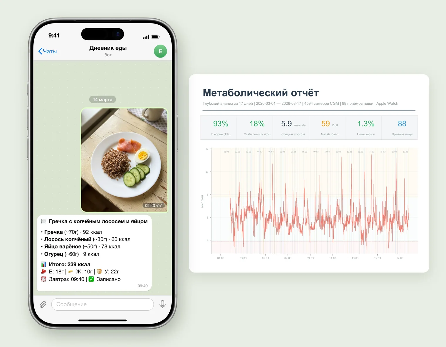
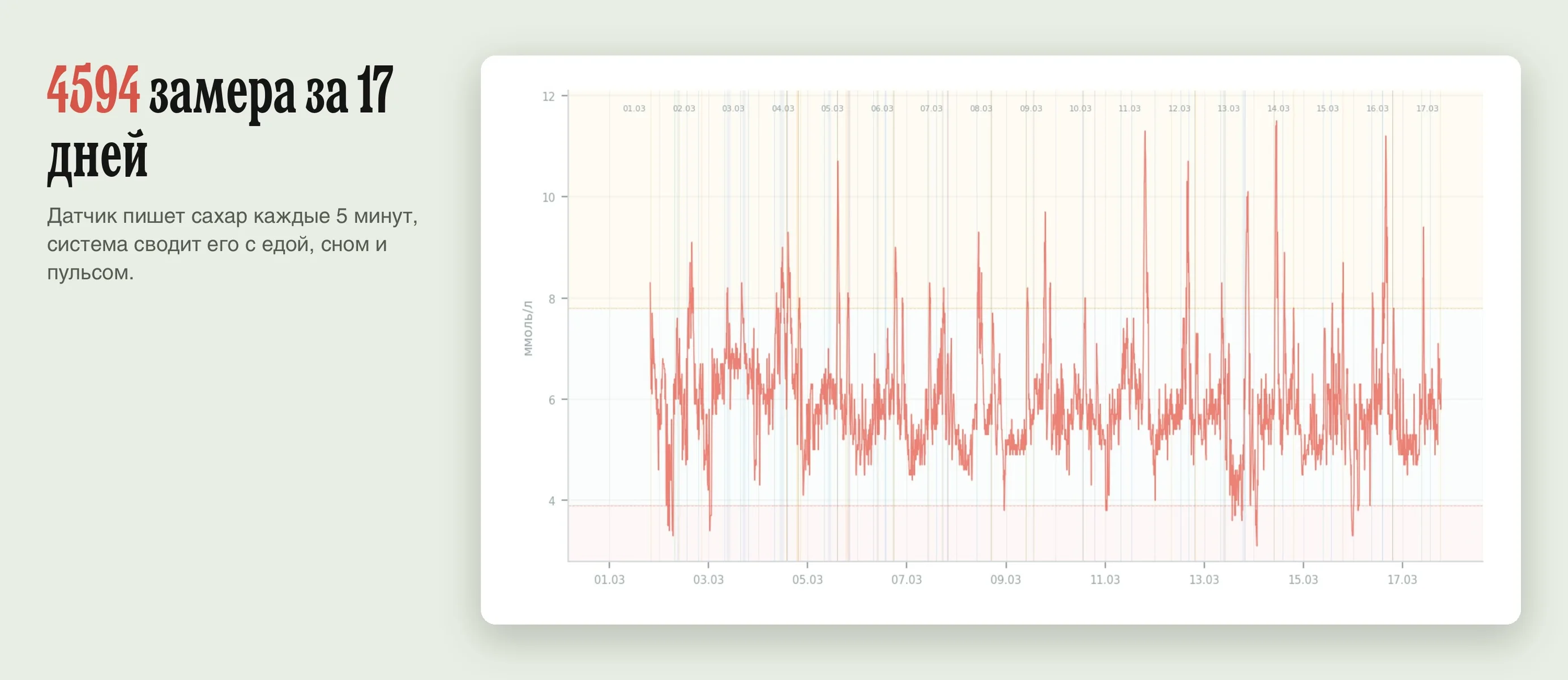
17 days on myself: plate photos to a bot, a smartwatch, a glucose reading every 5 minutes. The system merges it all into a report explaining what spiked my sugar.
Built it for myself over a weekend: a food bot, data collection from the watch and the sensor, analytics, a PDF report and the analysis prompt.
The table versus the sensor
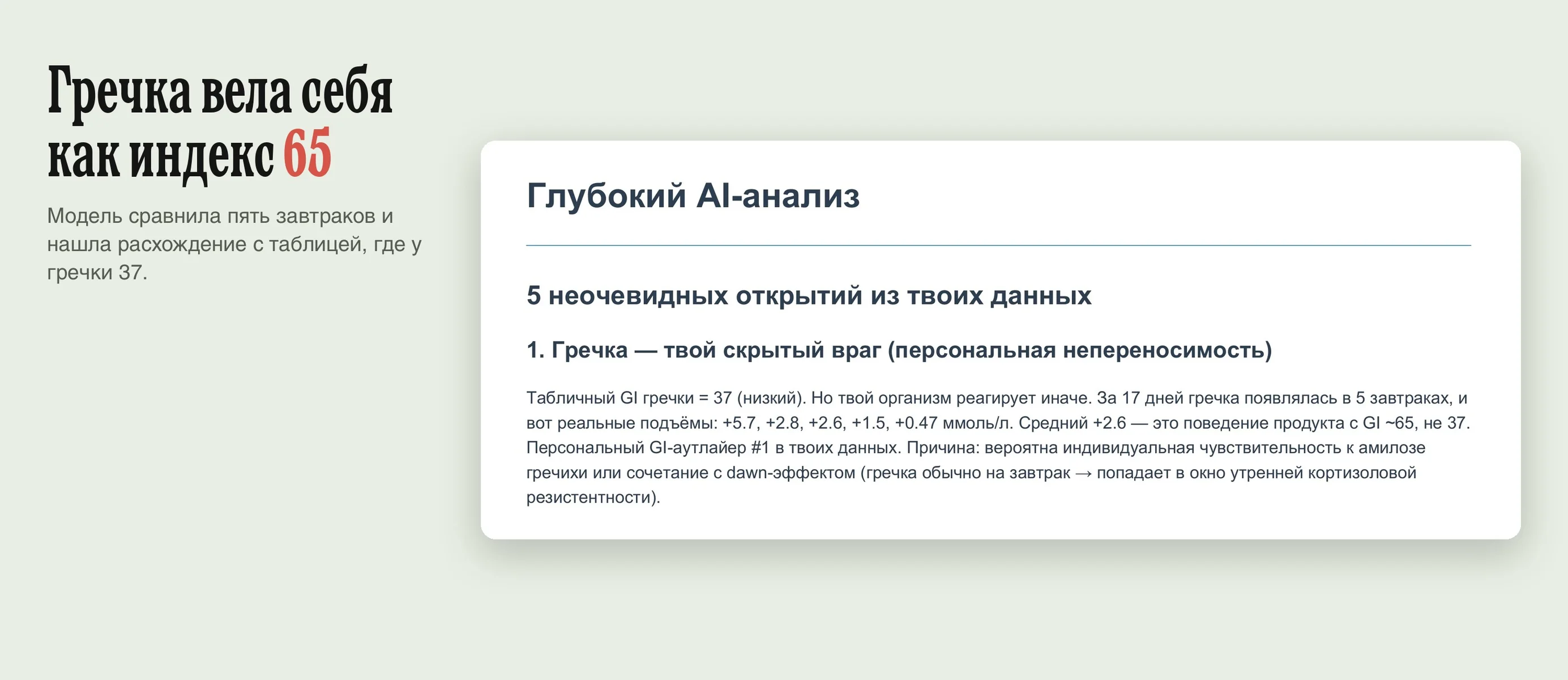
A real breakfast from the report, March 14- Buckwheat: index 37, low.
- Buckwheat, smoked salmon and egg: load 7.
- Expect a rise of 0.6 mmol/L.
The same breakfast raised sugar by 5.7. Over 17 days buckwheat was in five breakfasts, +2.6 on average. That's how a food with an index around 65 behaves, not 37.
Finding the cause in three data streams
I'd quit a manual food diary in three days. So I photograph my plate in Telegram: the model recognizes the food, estimates the weight, counts calories and macros and logs it.
The sensor sends sugar every 5 minutes, the watch sends heart rate, HRV, steps and sleep, the bot sends food. A script aligns them and measures each meal's rise, peak and recovery.
The prompt forbids the model to repeat numbers: "glucose 8.0" tells you nothing. It compares meals with each other, accounts for sensor lag and looks for what contradicts the tables.
What's in the report
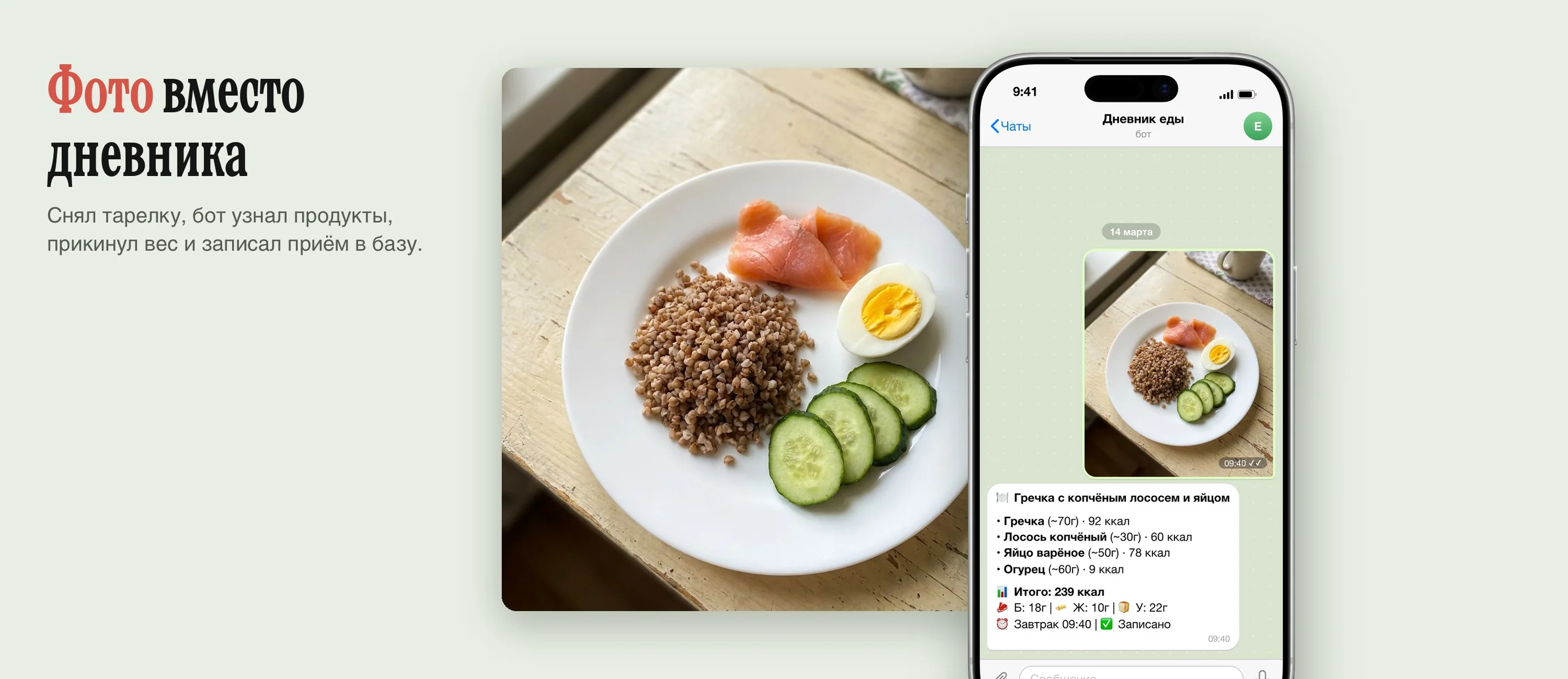
Snap your plate, the bot returns foods, weight, calories and meal time.
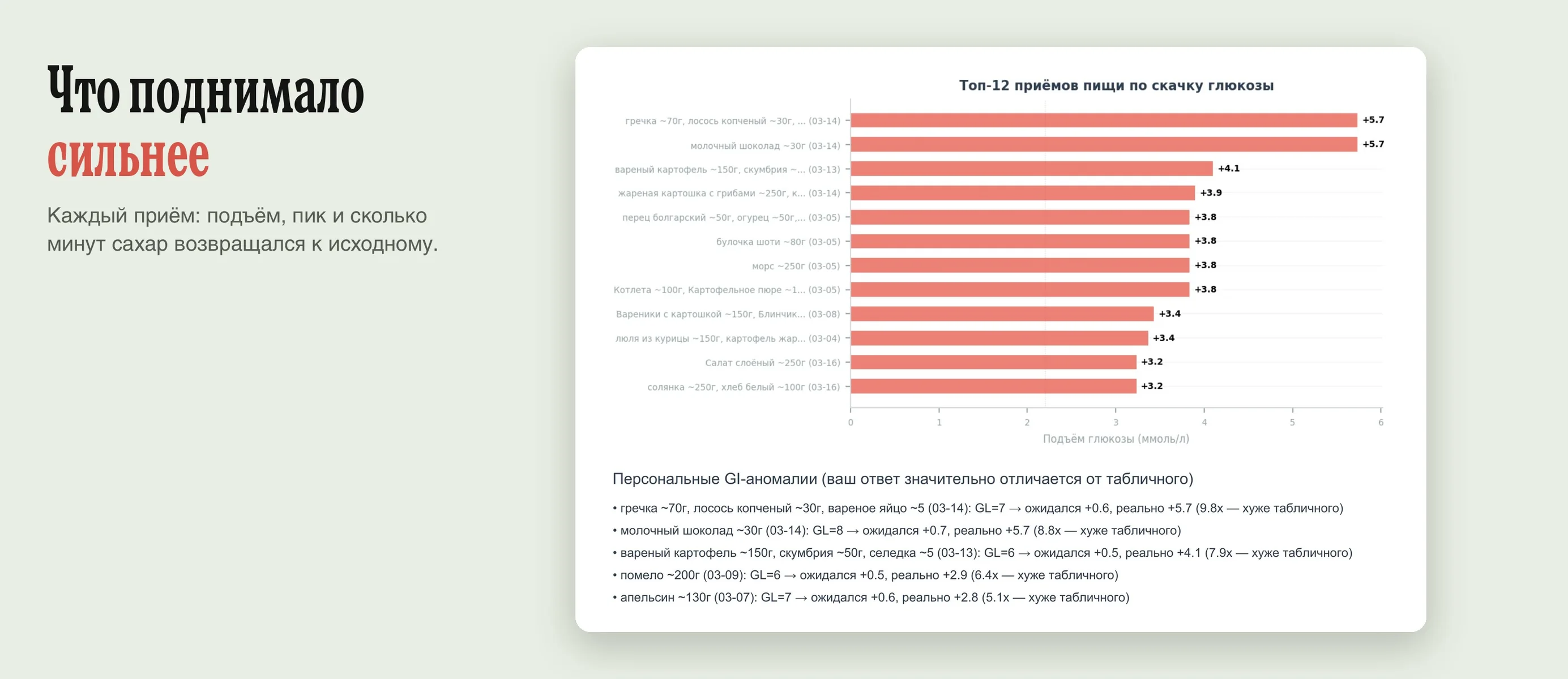
Rise, peak, speed and how many minutes sugar took to return to baseline.
What the table's glycemic load promised and what the sensor showed.
Night profile, morning rise without food, dips below normal.
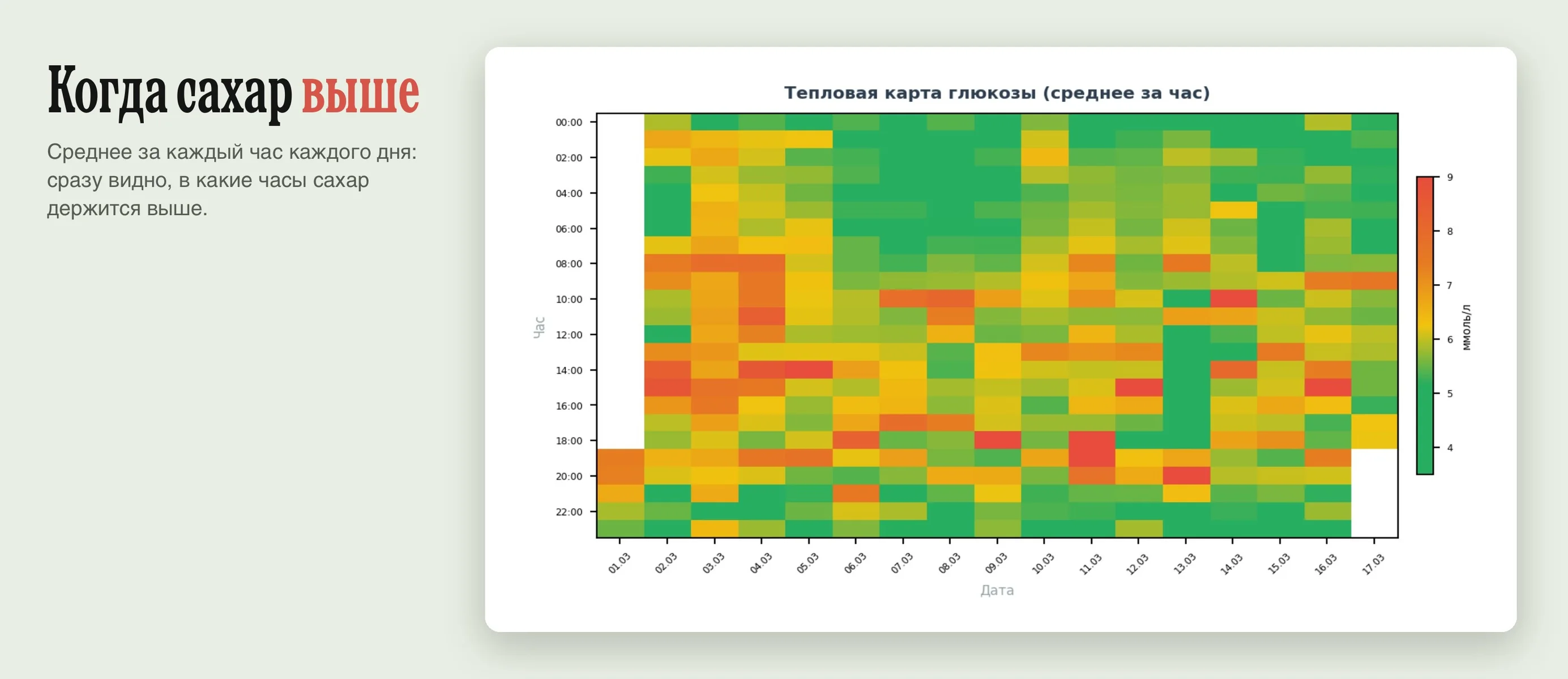
Average for each hour of each day: high-sugar hours stand out.
One number from five metrics, with its trend over the whole period.